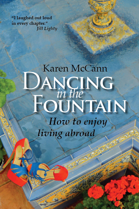
Thanks to the many, many blog and Facebook friends who voted on the cover layout! Although every entry had its supporters, by far the most popular was the version with the white lettering. Experts have told me that it will also be the most readable in small formats, such as Amazon listings. So it’s a practical choice as well.
I had several suggestions to increase the size of the subhead, to make it more visible, so I’ve done that here. And I suspect the design team and I will continue to tweak the details up until the last possible minute. But this is the clear winner, and you can expect to see it in a few months in printed and e-reader versions. Thanks again to all those who helped with this crucial decision!

Leave a Reply